JANUARY 12, 2019
In this article we discuss how less can definitely mean more when it comes to branding. Stripping away the unnecessary design elements from your brand can create room for the more important things.
The Basic Logo
The beginning of a simple brand is a basic logo. The trick is to strip down the unnecessary details and create a mark which is instantly recognisable, with or without colour, at all sizes. Having a logo which works without colour is becoming less imperative in the digital age. This is due to non-colour printing becoming less common (but it should still be considered).
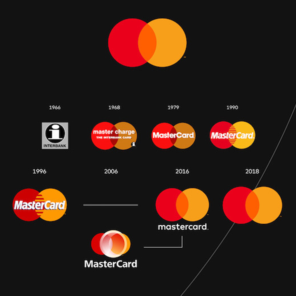
A great example of a brand which has simplified their logo in recent years is Mastercard. Pentagram designed the brands’s evolution, where the logo now appears nameless. This brings it into the iconic level of other brands such as; Nike, Instagram and Starbucks.
Simple Brands Make Lasting Impressions – Reducing Unnecessary Expensive Marketing.
If a customer sees your brand once or twice, and remembers it, then you have a lot less to do in terms of marketing materials. A strong brand will ensure customer recognition, meaning your target market is more likely to choose your brands product.
“They cut through the clutter by delivering what consumers want, when they want it, without hassle. By simplifying customer experience in a complex world, these brands win customer loyalty, which drives business results and creates value for shareholders.” – Margaret Molloy for Harvard Business Review
A simple brand creates a no-nonsense experience
Trade Shows
In the busy environment of a trade show, a simple brand can be a welcome break amongst the noise of other stands vying for attention. In the Kevzara stand we designed last year, their simple brand helped the visitors focus on the product without distractions. See the award-winning stand here.
Retail
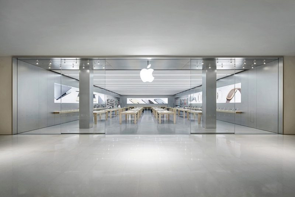
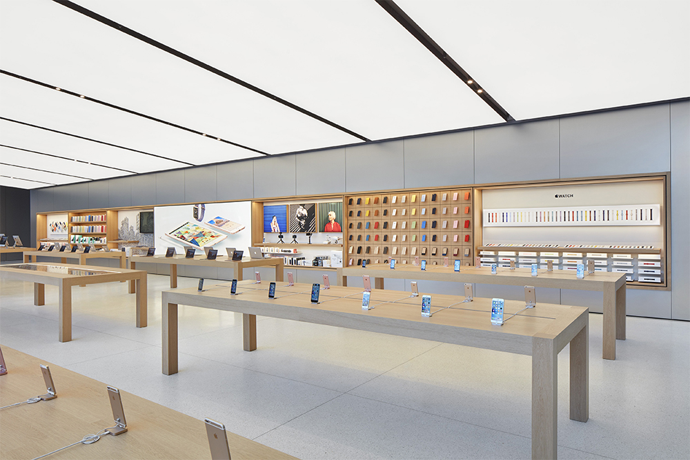
Go to visit an Apple store and you will see exactly how a simple brand can streamline a retail experience. The glass front shows the extremely simple interior – wooden tables, grey floors and walls with a large apple logo on the wall. Because of the simplicity of the brand, the customer only has one thing to focus on – the products.
Online
In a fast paced world where people can find out anything within seconds, customers expect the same thing from their online shopping.
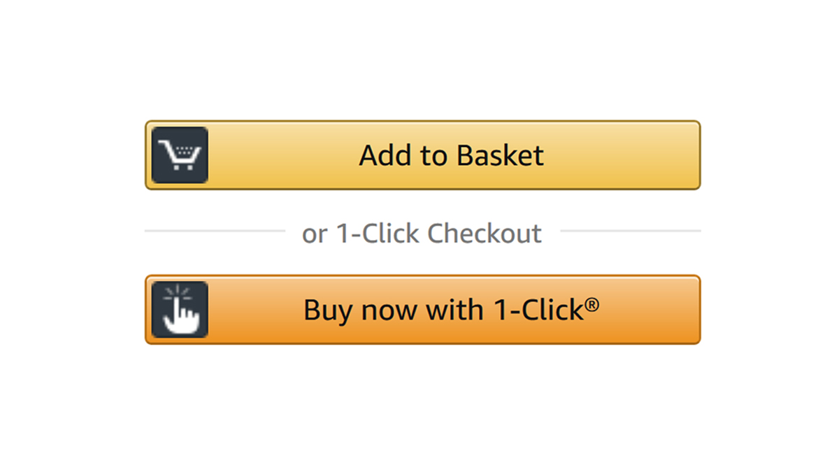
Because Amazon have a simple brand, their user experience (UX) is streamlined to fit the brand. There isn’t any software intensive graphics to run, or any imagery which might get in the way of the experience. Amazon revolutionised the game with 1-Click checkout, creating the simplest process for any online brand.
Brand guidelines become easy to understand and quick to read – meaning marketing materials can be made quickly & accurately
If your brand is simple, the guidelines are easy to interpret. This means you can have marketing materials created by external agencies quickly and efficiently. A simple brand guidelines; puts everyone on the same page, reduces design time, improves consistency and assures strong brand recognition.

